"The artist is not a different kind of person, but every person is a different kind of artist". - Eric Gill.
Projects from 9th Grade
Half-Portrait
About this project:
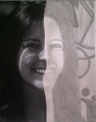
For this project we are studying about face proportion. We are learning how to draw faces in proportion and by creating this half- portrait we are going to use our knowledge to make it look good. It is very essential to use the proper materials and techniques. First I took a picture of my own, printed in black and white and cut the half of it any way I wanted. The way I cut the picture is not perfectly strait, but bent so that it looks better. Then, I glued one of the half’s into a drawing paper and started drawing what was missing with a pencil. With the bending stick it was easy to create shades and details. One of the techniques I used was to draw with the paper upside down so that I can draw carefully and follow how my face looked like. I notice that it is important to see carefully and use lots of shading in order to give color and live to the drawing.
Reflection:
I am very happy with the final result. At first I look at this project as a huge challenge for me as I am not very good at drawing. But as I did the project, I realized that it is easy if you did it with patience, plenty of time and being cautious. Sometimes I was very stressed because the pencil erased or it messed up. After I had done with the drawing, I was proud of myself because it looked good and everything had its proportion. If I will do my half- portrait again, I will improve it by applying better shades and also by making my drawing more realistic. I can do this by fixing some teeths or making my eye more alive and my hair too. The one thing I was really worried about was the shading and the wrinkles. I tried to shade my picture but it look really dark so I had to erase all the shading and start again. By repeating this, I learned to follow the colors of the original picture and to do it soft so that the wrinkles will notice more.
Clay Head
About this project:
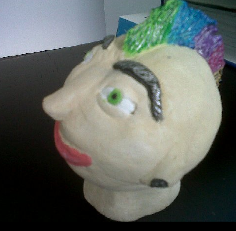
After practicing drawing with my half- portrait, I created a sculpture using clay and what I learned in class about face proportion. For this project, it is very significant to put facial features in the right place and to be neat. Here I use the proportion rules and facts like the eyes in the middle of the face and the proper place for the eyes, eye brows, nose, ears and mouth. First I played with the clay so that it will be softer and with the help of water, I started making the form of the face and the neck. Separately, I did all the elements of the face. When I finished with the clay, I let it dry for a few days and when it was completely dry; I painted it with watercolors. After the paint was dry, I added details so that it looked as realistic as possible but fun too.
Reflection:
I really enjoyed doing this project because clay is a really fun material to work with. Also, I am really good painting with watercolors. Even though it doesn’t seems complicated, it was difficult too because in a sculpture you observe more easily proportion rather than in drawing. One of the hardest things was to do the nose because it was hard to place it correctly and make it look good. Also, the eyes don’t look realistic because of the eyelids. I am not very happy with my sculpture because it doesn’t looks very realistic but mostly like a comic. I think this because of the colors of the hair, the nose and the lips. Many people when they saw my face asked me if it was a girl or boy because it doesn’t looks quite defined. It was pink lips, light green eyes but hair of a boy. My intention was a boy but people have different points of view. For the next time, I will make a more real mouth and make the traits more clear to see what sex it is. Also I will include more detail like a beard or make better eyes. In conclusion, with clay you can create really fun things but still make it realistic.
Semester Exam
About this project:
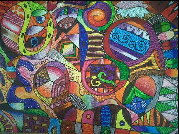
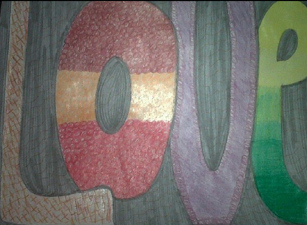
This project was our first semestral exam for which I put a lot of effort into. This a very creative project because its result was going to be abstract. We had certain directions to do it, but the rest was on your own. I had a drawing paper and a marker. With the directions of my teacher I had to do like: 10 lines, 5 circles, 3 triangles, bent and lines like waves, lines that touch both corners of the paper and more directions like this. Once I followed these instructions, I ended with weird shapes that were created by these lines. After doing this, it was the time to color it. I used color pencils, pens, markers and blending stick. These materials are great to do plenty of detail and textures. I also needed to follow the other instructions that told to mix certain colors like: red and blue, orange and red, yellow and green and more. But the most important objective of this project was to use those colors with gradation, pointillism, color value and cross hatching.
Reflection:
I think this project was the best one I had ever done. Not only because it was plenty of detail, it is colorful and attractive but for the amount of time and effort I put into it. I accomplished all my rules and objectives but at the same time, I had a lot of fun doing it. I will come home and do it without thinking its homework but, because I actually like doing it. One of my weaknesses was the time because I left the coloring for the end and it was the hardest part to do. I also had some trouble doing cross hatching or mixing properly the colors. However, in the end it looked nice. If I will repeat this again, I will not improve anything because I certainly did my best. Many people have come to me and say they love my project and others even took pictures of it and set it as screen savers. I am very proud and happy of my work. I think that these types of projects enable people to put effort into them and use their creativity.
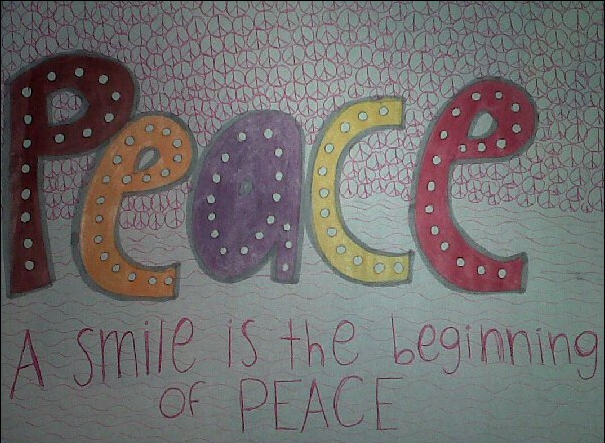
Pictures of some sketches
Valentina Delgado 9B